Hello, friends! I’ve been doing a lot of cover design lately, so I thought it would be nice to share some tips with you. If you’re like me (a college kid with very little money to spare), you don’t have the finances to hire a professional to make you an awesome book cover. So you have to do it yourself. But how? And where do you start? And what about all those complicated rules about using art and pictures you find on the internet?
Fear not! I’m going to share everything I’ve learned over the years, and if there’s a question I don’t get to, feel free to reach out or do a quick Google search–there’s lots of resources out there.
1. Keep up with the trends.
A good place to start is to hop on Amazon and search for books in your genre. You might search for something as generic as “sci fi books” or “Christian romance” or “middle grade mysteries.” Now, trends are constantly changing, but you’ll want to at least know some examples from your genre.
They say not to judge a book by its cover, but a cover, when well-designed, will tell you a lot about the story inside. So, knowing the trends that go with your genre will help you tremendously.
2. Know your audience.
Knowing your target audience will also help you with cover design. After all, a parent would never let their seven-year-old read a book with a dark, blood-spattered cover. A teenager probably wouldn’t pick up a book with brightly colored, cartoon-y animals on it. It goes pretty much without saying, but keep your covers age-appropriate.
Let’s look at some examples:

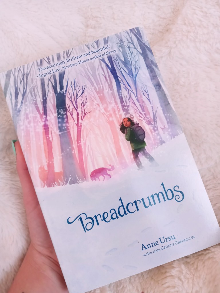
Breadcrumbs is one of my favorite books of all time. This is a middle grade novel (so, not many dark themes or content). The genre could be described as contemporary fantasy/fairy tale, and the cover communicates this perfectly. Note the animated feel and the soft colors. The fonts are fantastically elegant. Notice the light quality and how the girl is standing looking backwards while her adventure clearly lies ahead of her.
-by the way, please read these books, because they’re both so, so good-

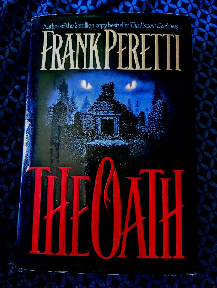
Now look at this book. It’s a lot darker than Breadcrumbs–an adult supernatural thriller, to be precise. (Keep in mind this copy is from 1995, so it’s not a representation of current trends of the genre.)
My younger brother talked me into reading The Oath, and I’m so glad he did. He told me it was actually the cover that made him want to read it in the first place, so whoever designed it was doing something right. Notice how dark colors are utilized–even in the sky. It’s creepy, and it hints at things which cannot be explained. And those eyes? They’re always watching you. Frank Peretti’s name is quite large and prominent: since he is a well-known author, his name does a lot of the work in selling the book.
Finally, notice how much the title jumps out at you: the creepy, dominating font and the blood-red color, which brings us right into the next point:
3. Utilize color psychology.
Color psychology is probably my favorite thing about cover design. Not only do most colors have symbolic meanings, multiple studies show that certain colors are associated with specific emotions. Marketing and branding specialists know this; it’s just another way they get you to buy their product.
There are so many good resources explaining this in depth, so I’ll go ahead and drop a couple links:
Color meanings and symbolism: How to use the power of color
Color Meanings–The Power and Symbolism of Colors
As an example, I’m going to use my own book cover, because when I was designing it, I chose each color very intentionally. So now you’ll get a little behind-the-scenes peek. 😉

For now just… ignore the fact that it’s sitting in my Christmas tree. For some reason this is the only nice picture I have of it.
Anyways, way back when the story was but a wee inkling, I decided black and white needed to be on the cover. Why? Because black and white are a classic representation of good versus evil, which is one of the main themes. Later on, I would bring in red, which ended up being the main color.
Red is a strong color. It can represent love or lust, or anger, or blood. Passion.
I also needed yellow to be on the cover, so that ended up being the color of me and Elizabeth’s names. Yellow is a softer color, cheerful, bright.
Think about your story’s themes. Does it deal with heavy, deep things, or light, optimistic things, or something in between? Think about the characters. How do they express themselves? What themes or emotions do they embody? Think about the genre. Is it gritty and dark? Is it a fairy tale? Is it a love story? Is it a tragedy or a comedy?
Colors can help give that first impression we get when we glance at a book cover. It can tell us about what themes and emotions we can expect when we crack open the story. But also, colors aren’t universal; some colors will evoke certain emotions in one person and completely different thoughts in another person. Get creative! And don’t be afraid to experiment!
4. What about art?
Ah, cover art. Illustrators are expensive, and maybe you’re not the best artist yourself, so what are you to do?
The good news is, there are a lot of sites out there with illustrations and photographs that are completely free to use however you want–even for commercial use! (Commercial use means that you’re making money off the thing you put the picture on.) Canva.com and Pixabay.com are the two sites I use most frequently, but there are a lot of other resources out there. Just look for the key phrases “royalty free” or “creative commons license.” (Always double check to see if the original artist requests that you attribute them as the original artist. And even if they don’t, it’s always nice to do so!) Also, even though many images you find on Google Images say “public domain,” many of them are not truly in the public domain, so be careful with those.
5. A quick note on programs
I’m gonna be honest: I don’t use fancy programs. I usually go to Canva.com to design covers (and any other graphics I need). It’s free, and they have a ton of resources and ideas to get you going. There’s also a paid version, but the free version has worked just fine for me thus far.
The only other graphic design program I really know of is Adobe InDesign, which I have not used but hope to try one day. It can get pretty pricey, though, which is the opposite of what this post is about.
If you know of any other graphic design programs, please drop them in the comments! I’m always looking for new things to try. 🙂
6. Practice!
This one seems obvious. Cover design is just like writing and any other skill in that you’ll probably start off kind of shaky, and get better the more you go on.
Let yourself make mistakes. Design bad book covers. It’s okay to start off really simple and play around with it until you figure out what looks right. Look at one of my earliest covers:

It’s, well… simple. It has a title. A few colors. A little design I thought was neat.
But you have to start somewhere, and let me tell you, seeing the name of my story on a cover like that, as simple as it was, made me so proud and inspired me to keep writing.
So keep designing! Experiment. Make different covers for the same story and see which one fits, or maybe even make a cover for a nonexistent title just to see what you can come up with. But above all: practice!
So, what are you waiting for? Go forth and design some book covers!
